How do you market video games to a world that’s never heard of them?
This was the challenge faced by the pioneers who turned video games into an industry. There was no established audience, no established template, and no established language for advertising this technology. The first marketers of video game had to make it up as they went along.
This is the story of the first attempt, targeted at arcade operators who were looking to make a profit of their own.
Creating The First Arcade Video Game
In 1969, aspiring entrepreneur Nolan Bushnell witnessed a demonstration that would not only change his life, it would set him on a course to change the world.
It was a computer program at Stanford called Spacewar!, a competitive two-player game that involved maneuvering spaceships around the simulated gravity of a central star while shooting at each other. Today we’d call it a video game, but that term didn’t exist yet. https://www.youtube.com/embed/1EWQYAfuMYw Spacewar! played on a PDP-1 in 2017.
Spacewar! was created in 1962 as a fun and interactive way to show off the capabilities of the PDP-1, a large and expensive computer that was considered a “minicomputer” because it wasn’t as large and expensive as the typical ’60s computer.
The developers of the game had given no thought to trying to monetize it, but Nolan Bushnell had once run a penny arcade back in college, and he immediately saw coin-op potential. He spent the next two years conceptualizing an arcade version, partnering with two co-workers from his day job at Ampex, a developer of cutting edge recording technology. The trio decided to call themselves Syzygy, a word describing when three or more objects in space align.

But they soon realized that any machine advanced enough to run Spacewar! was going to be too expensive to mass-produce as a coin-op. Syzygy was forced to simplify the game.
They removed the gravitational star from the center, and replaced the second player with rudimentary AI enemies. It was now an affordable single-player UFO-shooter, and Syzygy struck a deal with local coin-op manufacturer Nutting Associates to produce it.
But how to promote it?
Arcade Games In The Pre-Video Era
If you’re a manufacturer of coin-op machines, your customers aren’t the people pumping coins into the machines — your customers are the operators who buy and place the machines. Advertising to operators means taking out ads in trade magazines and sending out flyers.
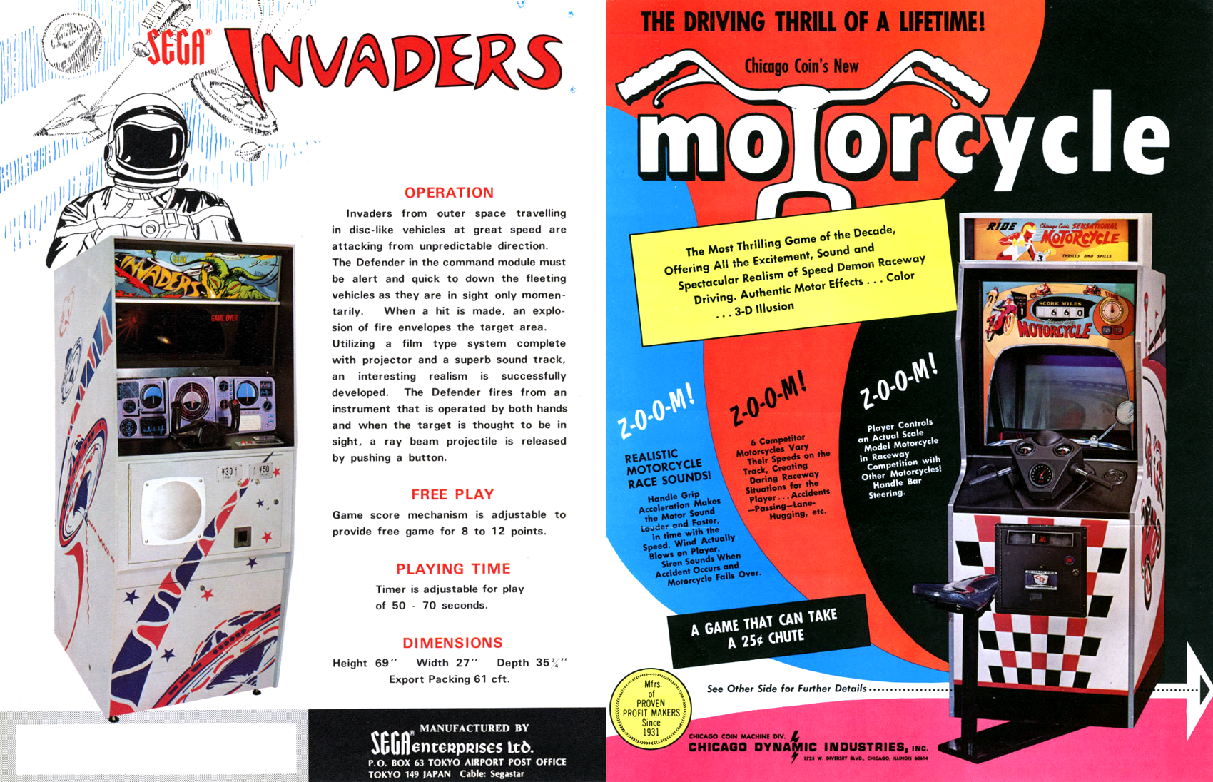
Although coin-op video games didn’t exist yet, coin-op arcade games did. They even looked a lot like modern arcade cabinets, just instead of a TV screen, the playfield was made up of lights and moving parts, and sometimes a projector. Today we call these electro-mechanical games, but some of the manufacturers’ names might still sound familiar to you: companies like Midway, Williams, and Sega.
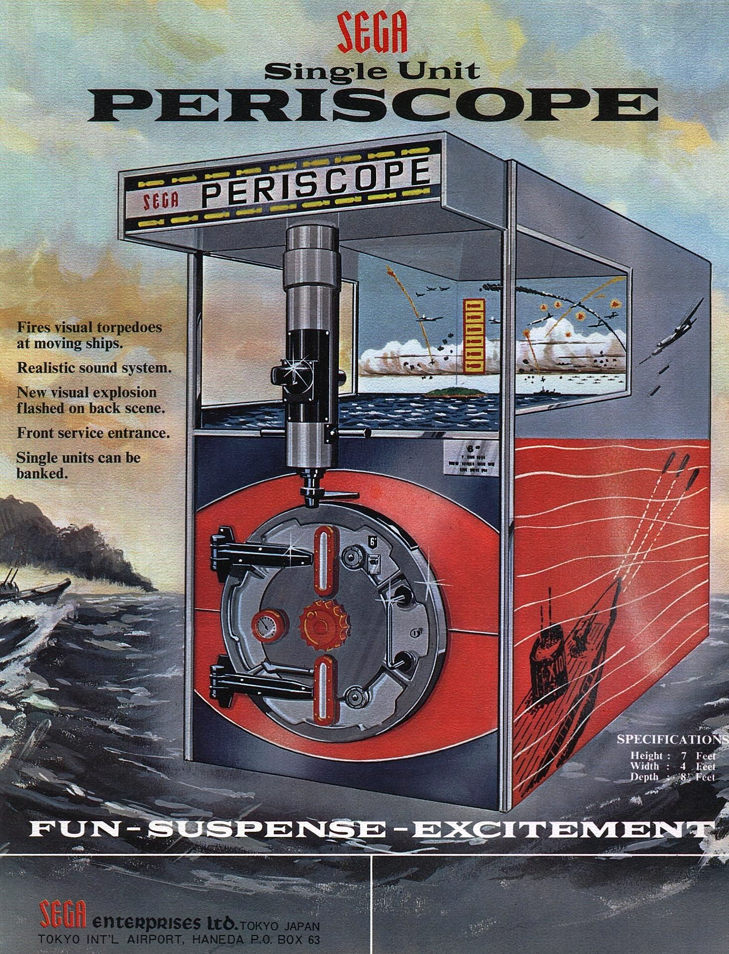
In fact, Sega played a major role in revitalizing the American arcade industry in 1968 with the release of an ambitious machine called Periscope, which popularized quarter play back when most games cost a dime.
The three biggest hit arcade games of the late ’60s were Periscope, Chicago Coin’s Speedway in 1969, and Nutting Associates’ Computer Quiz.
Introduced in 1967, Computer Quiz had a very different look from other arcade games at the time. The cabinet that looked more like a modern retro ATM than a game, and it was missing the usual side art and colorful marquee illustration.
This was likely done on purpose, to play up that this wasn’t a mere game — it was also educational.
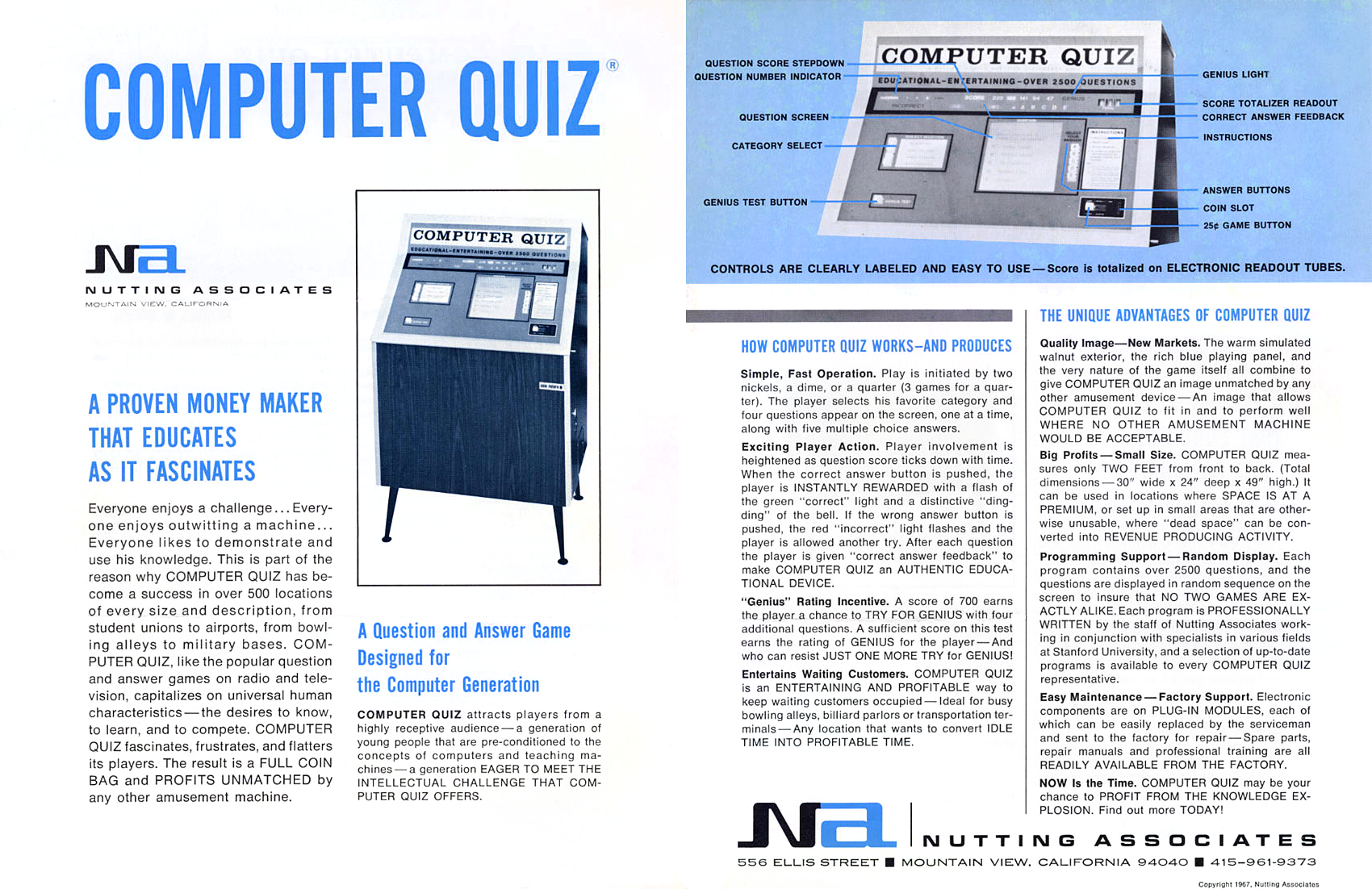
“Educates as it fascinates.” The flyer continued the theme, eschewing an exciting and colorful layout in favor of something that looks like it came out of a textbook. And it worked, at least initially. This was a time when coin-ops were still associated with organized crime in a lot of people’s minds, and Computer Quiz felt safe.
Safe, but also maybe a little boring.
A year later, Nutting Associates started to spice up their advertising. It began with a full page magazine ad — a rarity for an arcade game — that appeared in trade publication Cash Box.
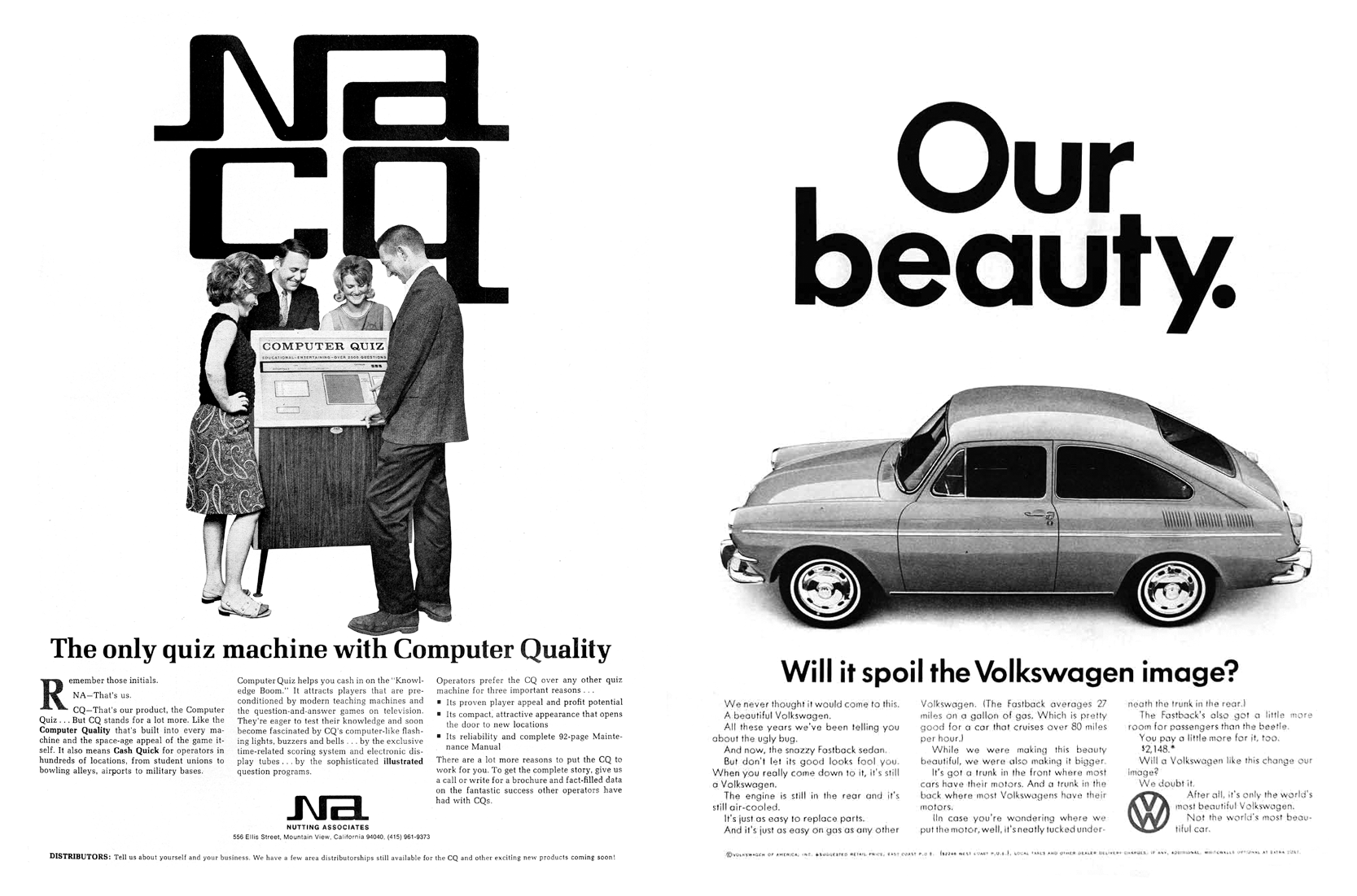
I don’t think it’s an accident that Nutting’s ad mimicked the format of Volkswagen ads. For one thing, it was an extremely popular ad campaign throughout the ’60s, and is still considered possibly the most influential ad campaigns of all time.
But also, the Volkswagen was an squat, ugly car trying to compete in a well-established American market where being stylish and enormous mattered more than being solid and efficient.
The ad campaign played up these differences, breaking all the rules in the process. Car ads never used photographs because it was felt they made cars look “dumpy” in comparison to idealized illustrations, often featuring the cars in beautiful settings; Volkswagen ads used only photographs of the car, almost always set against a blank white background. American cars were always trying to be bigger and roomier; Volkswagen asked Americans to “Think Small,” forty years before Apple asked them to “Think Different.”
Incidentally, the first year or so of ads only referred to the car as a “VW,” which might be why “NA” is attempting to explain what “CQ” means.
However, there are also a few ways in which Nutting’s ad diverges from the Volkswagen philosophy. Volkswagen ads avoided the cliche of happy, beautiful people that show you how happy and beautiful you will be if you buy one.
Volkswagen ads also used a lot of humor, at a time when humor in ads was considered off-limits. “People do not buy from clowns,” was the popular wisdom parroted by every other ad agency. Volkswagen ads often went for self-deprecating humor, at that. But I don’t think Nutting was ready to admit that Computer Quiz was squat and ugly.
Later that year, the ads moved even further from “safe” and into…sexy?
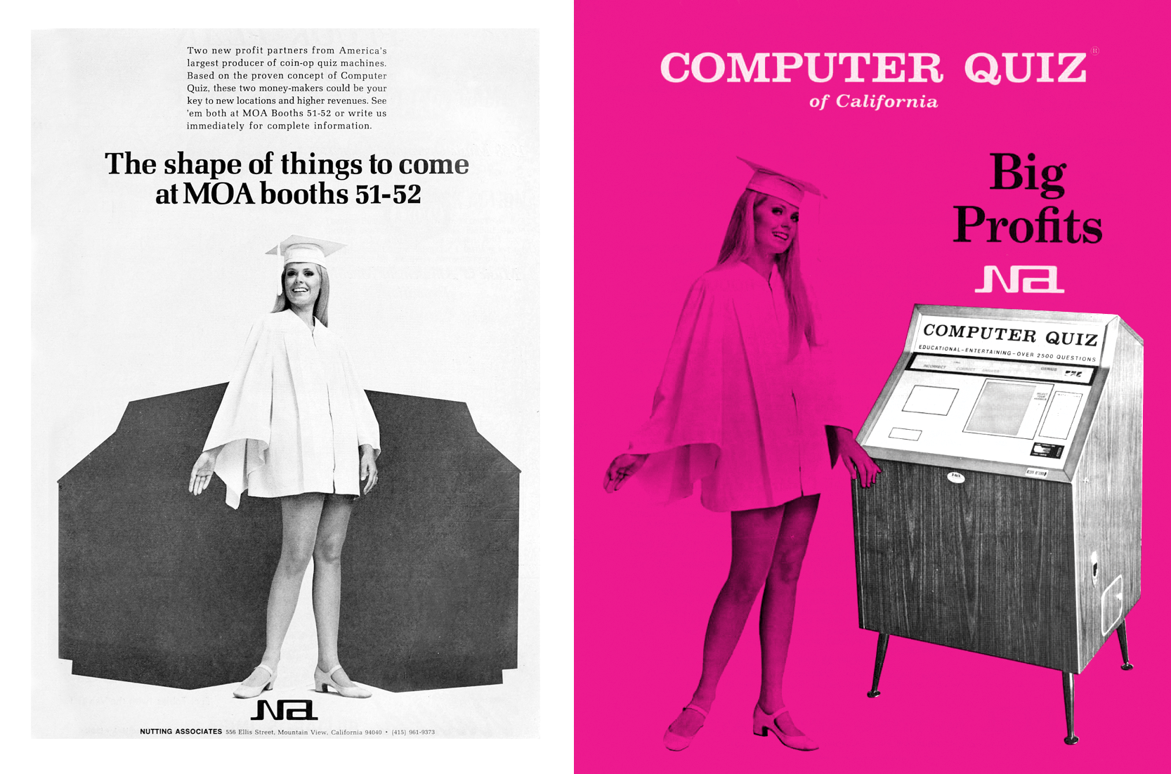
Booth babes and products under wraps were fixtures of auto shows, and Nutting tried to channel that for the announcement of two new games to debut at MOA, a trade show for coin-op machines. The same model posed next to Computer Quiz in a redesigned flyer that cries out for a slogan like “Smart Is Sexy.”
Around this time, other manufacturer’s arcade flyers were moving from limited color to full color printing. Whether for budget reasons or just to stand out from the crowd, Nutting stuck with the limited color look — and models posed next to machines — well into 1970.
But now it was 1971, and none of Nutting’s other games were catching on like Computer Quiz had. Nutting needed another big hit. To capitalize on the recognizable name, Syzygy’s UFO-shooter became Computer Space.
Promoting The First Arcade Video Game
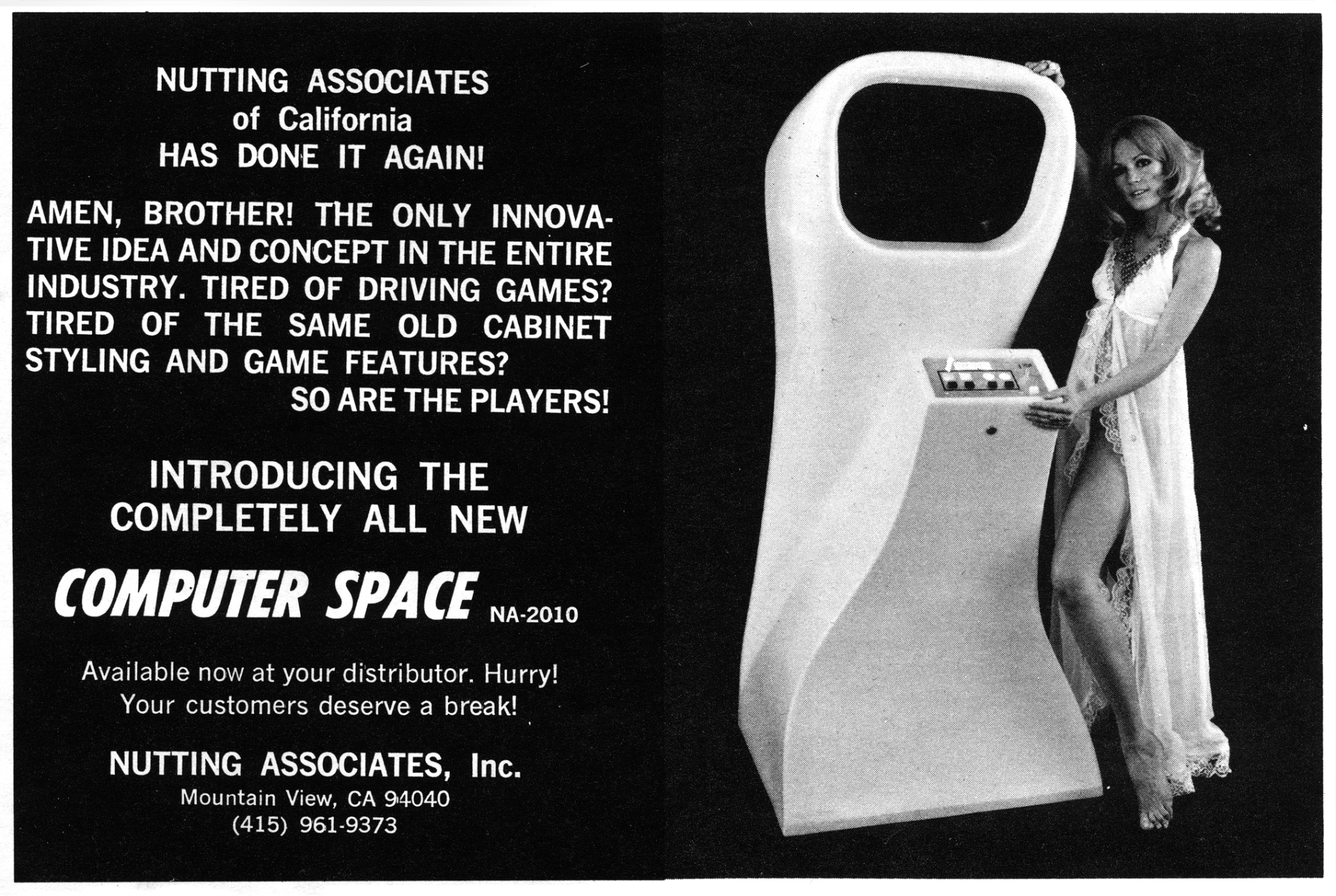
Despite the similar name, Computer Space was a very different type of game. Nobody had seen an arcade use a TV set as a play-field before, and that was sure to attract attention. But to get people in front of the screen, the cabinet itself needed to stand out.
The cabinet was still free of illustrations, but instead of squat and boxy it became tall and curvy, with a shiny car-like finish. The molded fiberglass shape looked like a sci-fi prop (and even showed up for a cameo in 1973’s Soylent Green).
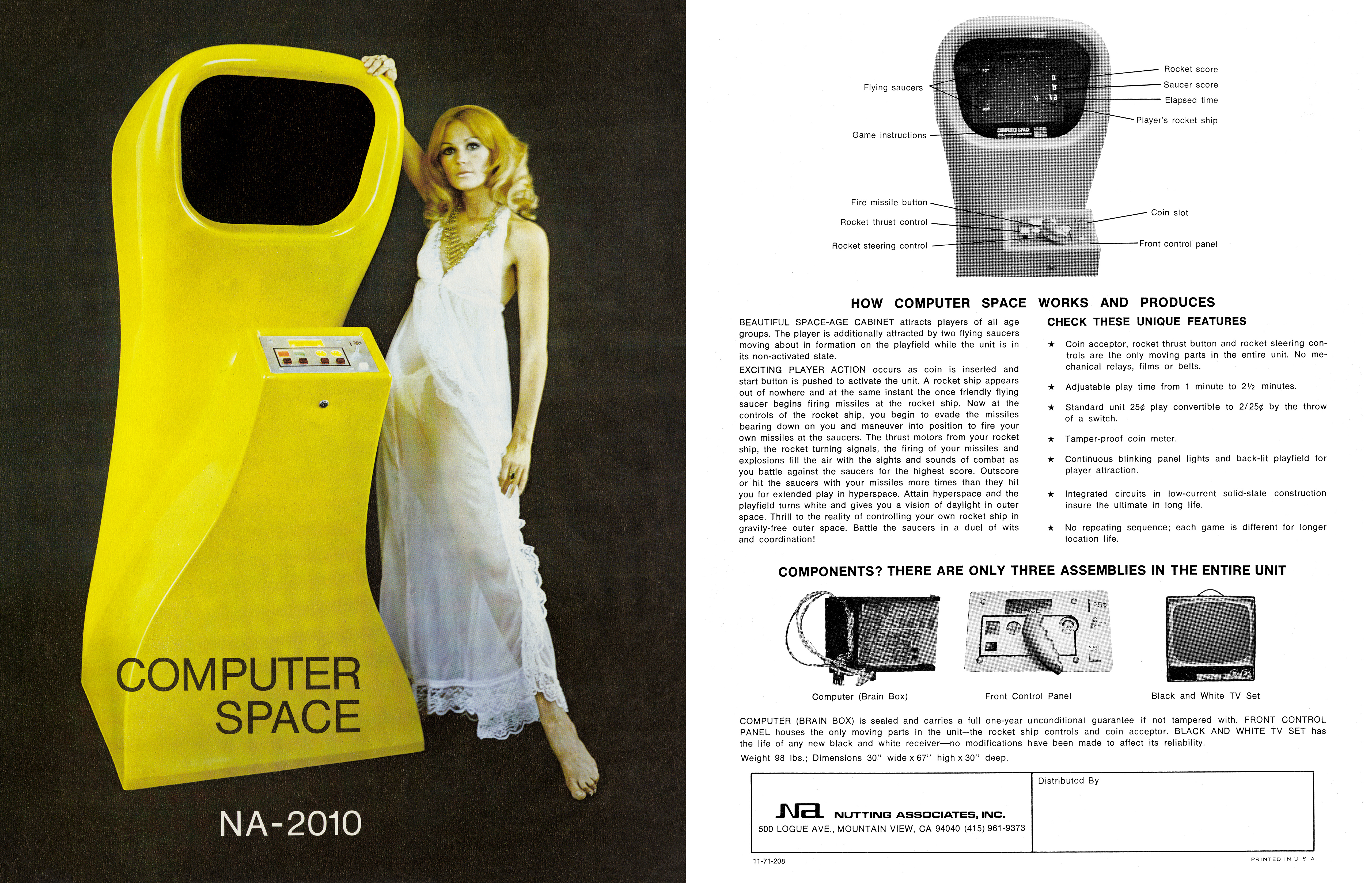
The flyer still had a model posing next to the game, but now her face was serious instead of smiling. The image was finally printed in full color, but still without the usual illustrations or garish blasts of color that were the trend. It looked like a car ad.
A car ad, but not of the Volkswagen variety. I have a strong suspicion they modeled it on a specific Mercury ad from earlier in the year.

Unfortunately, it looks like Nutting lost their graphic designer between 1968 and 1971. The front of the Computer Space ad has the most baffling and arbitrarily placed text I’ve ever seen on a flyer. It almost requires a strange sort of skill to make Helvetica look bad, but they figured it out.
There are also subtle problems with the photograph itself. If you look closely at the model, her head and shoulder are blurry. She was probably still settling into her next pose when they snapped that one, and either didn’t notice or didn’t care enough to select a different shot. Or maybe they liked how, if you look closely, you can see the model’s underwear through her too-sheer gown.
While we’re looking closely, note that the screen area of the cabinet is a darker black than the background. This might’ve been a last minute to cover up a game screen that hadn’t photographed well?
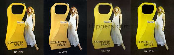
Also, the image wasn’t properly color corrected. It’s so bad, it seems like scanners with auto-color enabled want to shift the hue to a yellow-orange, so the model’s skin looks a little less like a Simpsons character. Or maybe the color is being shifted manually by the uploader, to give it a more natural look. Either way, it seems like half of the Computer Space flyer images on the internet have more of an orange-yellow hue, while the other half look pure yellow like the one Frank Cifaldi scanned in for this article.
Another issue that makes the flyer tricky to scan is that the paper has a canvas-like texture to it that can look like dust or cracks when scanned. I wonder if the texture meant to make it seem like art?
Let’s just say there’s a strong “ambitious amateur” vibe to the flyer, and the lack of quality control extends to the back. While the layout of the back at least looks competent, they made a mistake with the photographs and featured a cabinet with completely different set of player controls than the front!
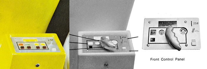
Syzygy briefly tried out this rotating lever during location tests after noticing in location that some players were struggling with the concept of using buttons to rotate the ship, but it didn’t last the night before breaking.My question is how such a short-lived configuration made it onto the back of the flyer, when there was obviously a photo-shoot for the front that used the button controls. It’s a mystery.The other interesting thing about the back of the flyer is what it doesn’t say. The term “video game” didn’t exist yet, and they made no attempt at coming up with a word themselves. The flyer only refers to Computer Space as a “cabinet” or a “unit.”The language is similarly dry when discussing the TV set itself, focusing purely on the practical aspects. There are “no mechanical relays, films or belts” that might break on you, with “solid-state construction” that will give you “the ultimate in long life.” It even uses electro-mechanical arcade language when describing the screen itself as a “back-lit play-field”Was Nutting simply struggling for the language to properly describe it? Or were they purposely downplaying the screen because a black and white TV set wasn’t as visually exciting as the color cars projected in Speedway and its clones? You almost had to see Computer Space in action to really understand how differently it played from electro-mechanical games. The best the flyer could manage was “no repeating sequence.”
As with Computer Quiz, Nutting ran magazine ads for Computer Space in Cash Box. The text boldly criticized the arcade industry’s tendency to imitate existing concepts rather than innovate new ones. The irony.
The ad used an alternate shot from the flyer photo-shoot. Did they notice the blurriness, or just want to change things up? Either way, quality control problems struck again in the ad’s first appearance. Somehow they managed to set the type at a slight diagonal in relation to the border. There are also some white specks that I initially thought were printing anomalies, but after comparing several different scans of this page, the same specks appeared in every copy of this issue. You might also notice the bottom edge of the ad has a “bump” where the photograph meets the black rectangle the text is set in.
It’s a real shame, too, because this is an important piece of video game history, and they obviously didn’t realize it at the time. This is the very first magazine ad for a video game, ever.
But there’s one caveat. It wasn’t the first magazine ad aimed at actual video game consumers. That distinction goes to the first home video game.
Additional Sources: Arcade Flyer Archive, Atari History Timelines by Michael Current, Atari Inc.: Business Is Fun by Marty Goldberg and Curt Vendel, FlyerFever.com, PinRepair.com, They Create Worlds by Alex Smith, Think Small by Frank Rowsome, Jr., Videogames: In The Beginning by Ralph H. Baer.
Special Thanks: Wietse van Bruggen, Frank Cifaldi, Ethan Johnson, and Alex Smith.
Follow me on Twitter: @katewillaert